PlutoPay
PlutoPay is a comprehensive financial web app that allows users to quickly pay and transfer, and easily manage their income and expenses. The app is designed for anyone who wants to conduct and manage all their financial activities with a mobile without carrying around physical cards and going to a bank.
PROJECT OVERVIEW
Problem Statement
Our users who need a way to securely transfer money to their friends who use different financial apps because they cannot transfer money between different e-wallets and want to avoid the hassle of installing more financial apps, or going to a bank to withdraw cash.
We will know this to be true when we see how many users continue to use our portal for person-to-person money transfers.
We will know this to be true when we see how many users continue to use our portal for person-to-person money transfers.
Proposed Solution
Users will be able to connect with other financial apps that are partnered with our portal when transferring money, so that they can immediately transfer to their friends who are using different financial apps.
My Role
UX Design
UI Design
UX Research
UI Design
UX Research
Tools Used
Adobe XD
Adobe Illustrator
Balamiq
Optimal Workshop
Usability Hub
Adobe Illustrator
Balamiq
Optimal Workshop
Usability Hub
Duration
Jan 2021- Sep 2021
1. EMPATHISE
Competitive Analysis
As a first step, I conducted a SWOT analysis against competitors with similar features to understand how competitors are solving user pain points in the markets I am working on.
Research Objectives
- To understand what problems our competitors are solving for our users and how.
- To get an idea of what users might expect from our web app
- To identify underserved opportunities in the market
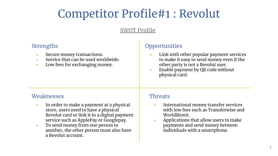
Competitor#1 Revolut

Revolut which was originated in the UK provides a service that allows people to manage their balance, exchange money, and transfer money on the portal by registering a credit card or bank information. It also issues physical debit cards that can be used for payment.
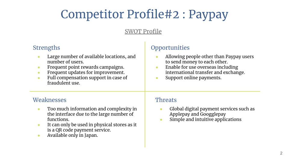
Competitor#2 Paypay
Paypay is the most used digital payment service in Japan. The service is free to download and enables to make payments and transfer with just a mobile by linking it a credit card or bank account.
Our Opportunities
Based on the above analysis, PlutoPay could take the following ideas to become outstanding.
- Make it possible to make payments both in stores and online, without having to issue a physical card.
- Allow international payments and transfers.
- Provide the feature to send money to users who do not have a PlutoPay account.
- Keep the interfaces simple.
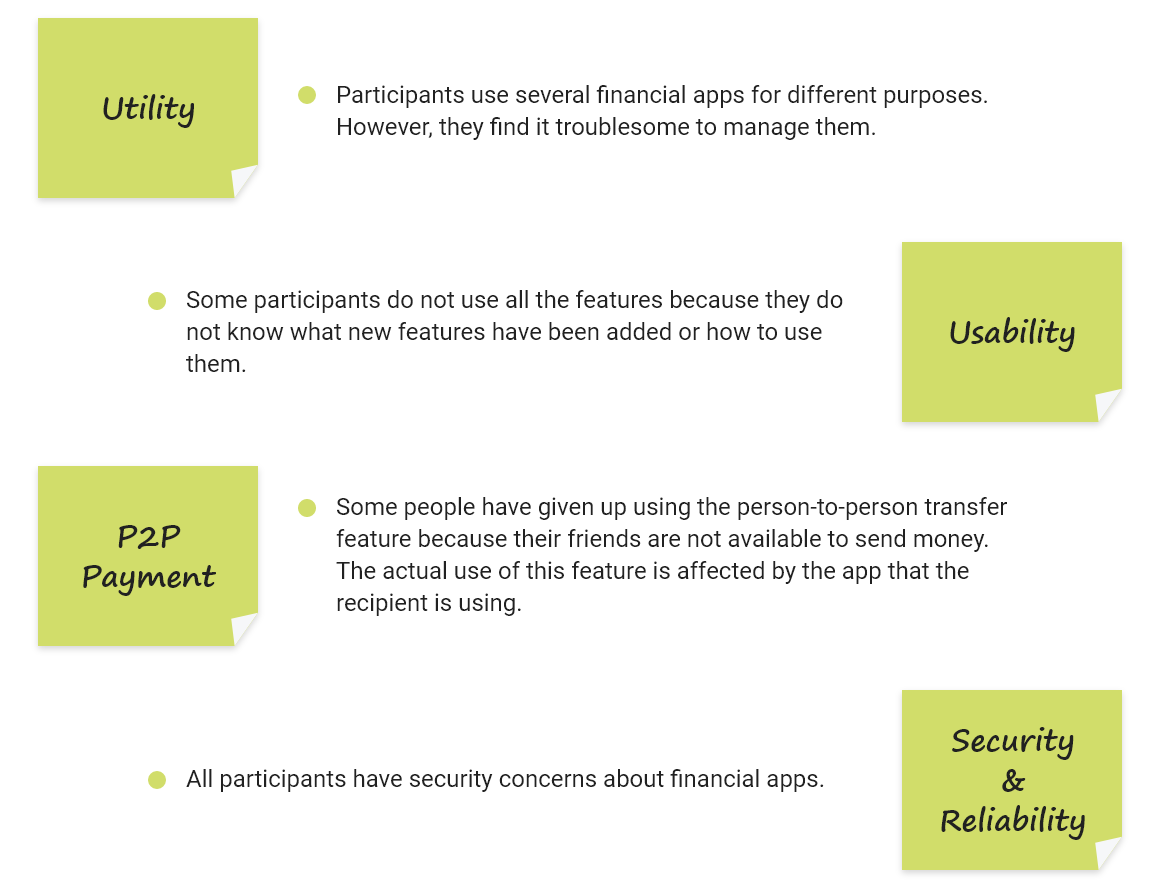
User Research
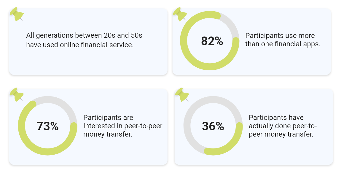
As for the user research, I first collected quantitative data with a user survey to know our target audience and people's general financial behavior. Then, with the results of survey in mind, I conducted user interviews with three participants to understand people's motivations and pain points.
Research Objectives
- Identify the potential users of our products.
- Understand users' financial behavior online.
- Discover users' goals and motivations for using digital financial services.
- Determine users' pain points for digital money transfer services that currently exist
User Survey Takeaways
User Interview Takeaways
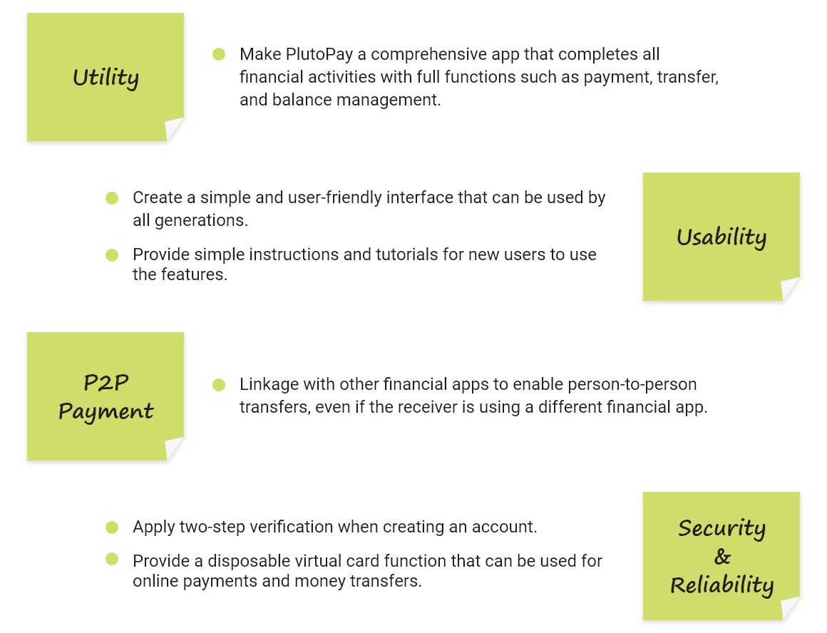
What can PlutoPay do for users?
In order to solve these user issues that I have discovered though my research and analysis, I came up with the following ideas.
2. DEFINE
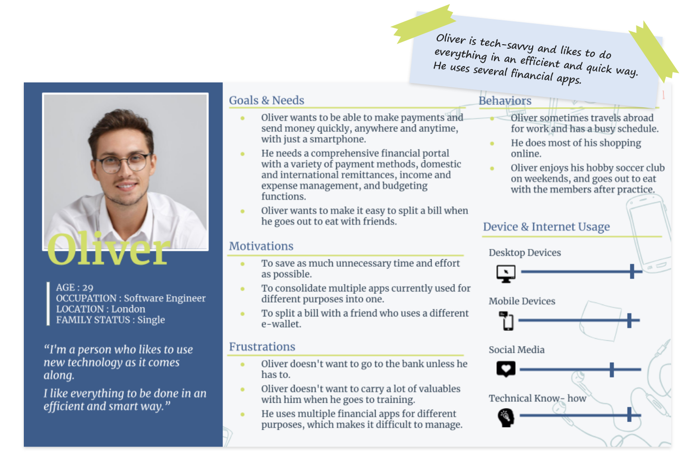
Persona
Through competitive analysis and user research, I was able to discover people's pain points for financial apps and identify the features that PlutoPay should have to solve them. In this phase, I defined the potential users of PlutoPay and establish two personas to create a user-centered design. I also mapped a user journey to get a bird's eye view of the user's experience and emotions. These helped me empathize with their challenges and motivations and view the project through their lens to make design decisions that were valuable to them.


3. IDEATE
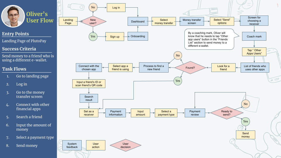
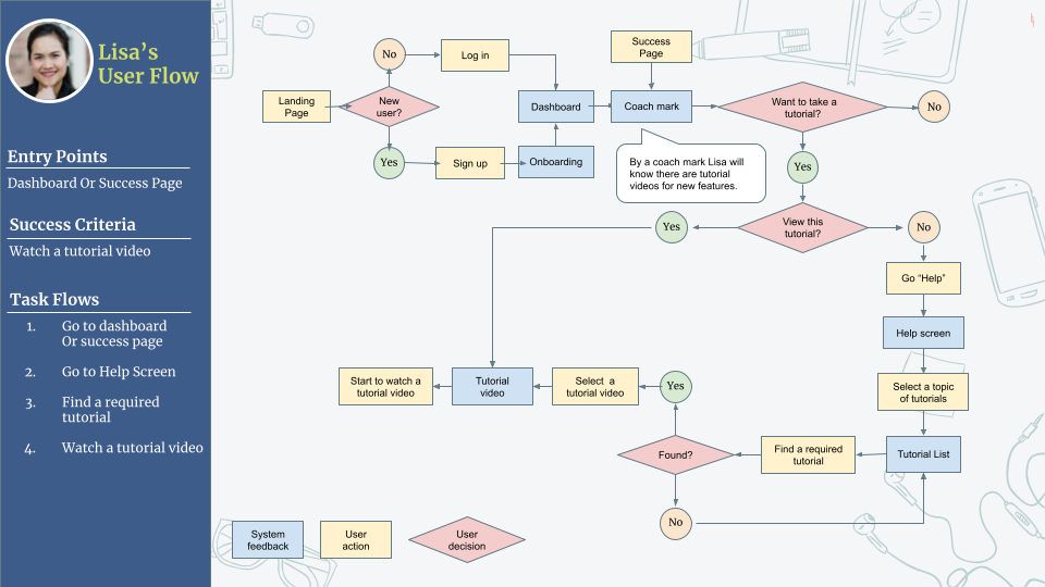
User Flows
I created three user flows for the core features of PlutoPay: money transfer between different e-wallets, tutorials, and virtual cards. By visualizing the path the personas would take on PlutoPay to achieve their goals, I was able to step back and focus on the user flows rather than the individual pages to consider the most efficient and simple flows. It also helped me to identify which screens are needed in the app.
4. PROTOTYPE
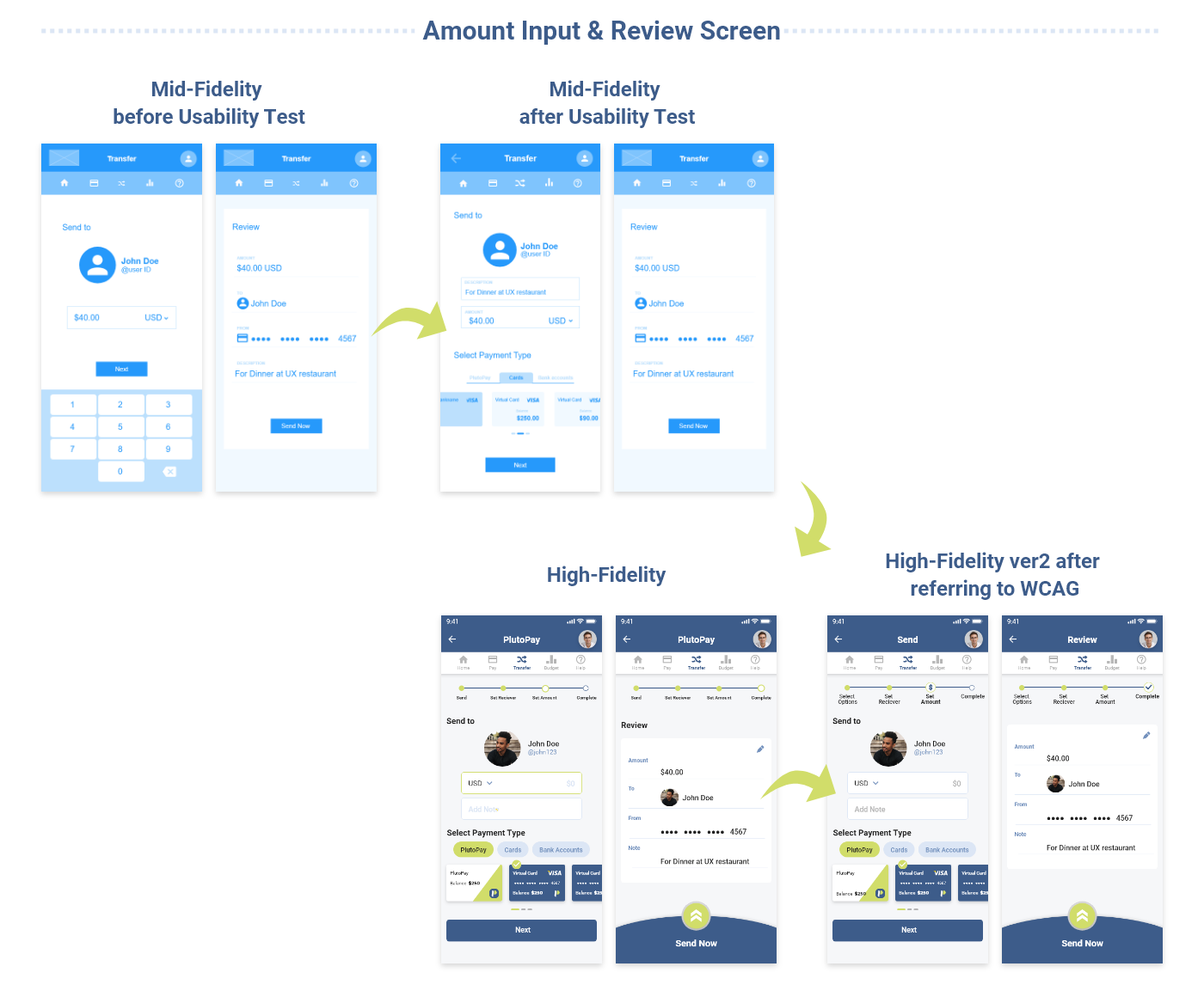
Once I had a clear vision of what to offer and to whom, I took the ideas from the earlier insights and incorporated them into the actual screen design of PlutoPay's three core features. I started by sketching out my ideas by hand and creating a Low-Fidelity Prototype that focused on function and structure. Then, I developed the Low-Fidelity Prototype into a Mid-Fidelity Prototype that shows more design details and basic interactivity.
Low-Fidelity
As a quick and effective way, I sketched out my ideas by hand and created Low-Fidelity wireframes that focused on functionality and structure. The Low-Fidelity wireframe was then developed into a clickable prototype using the online tool Marvel.

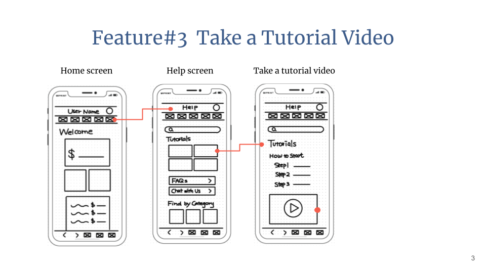
Mid-Fidelity
Users can select the most suitable teaching materials by purpose. The flashcard-style design helps users intuitively determine how to use the app (tapping to flip). By placing a check mark on the flashcards, the words are classified as new words, and users can review only that group.

5. TEST & ITERATE
Usability Testing
I conducted usability testing, a method of evaluation research, using the prototype I created to assess the learnability of new users operating the application from a mobile device.
Test Objectives
- Determine whether participants understand what the app is about quickly and easily, and the value it provides.
- Observe how users navigate from home screen to complete tasks given.
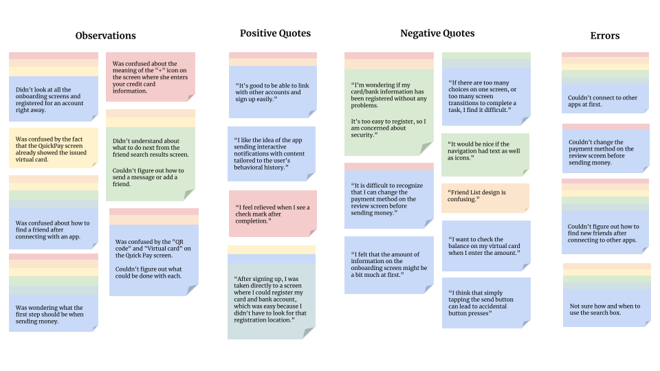
Analysis
I organized the data obtained from the test using Affinity map and Rainbow Spreadsheet, and evaluated the severity of the errors based on Jakob Nielsen's four-step rating scale. Their feedback points out the problems with this prototype and indicates that it needs to be improved.
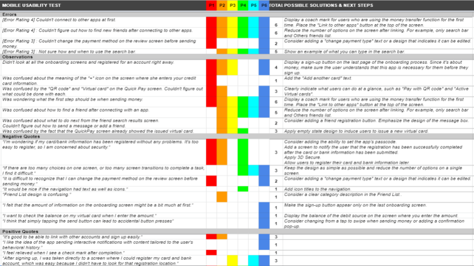
Iterate
As a next step, I improved the design based on the evaluation results. For the major issues identified in the usability tests, I came up with solutions and improved the design. Here are the changes to the issues that marked as high severity.
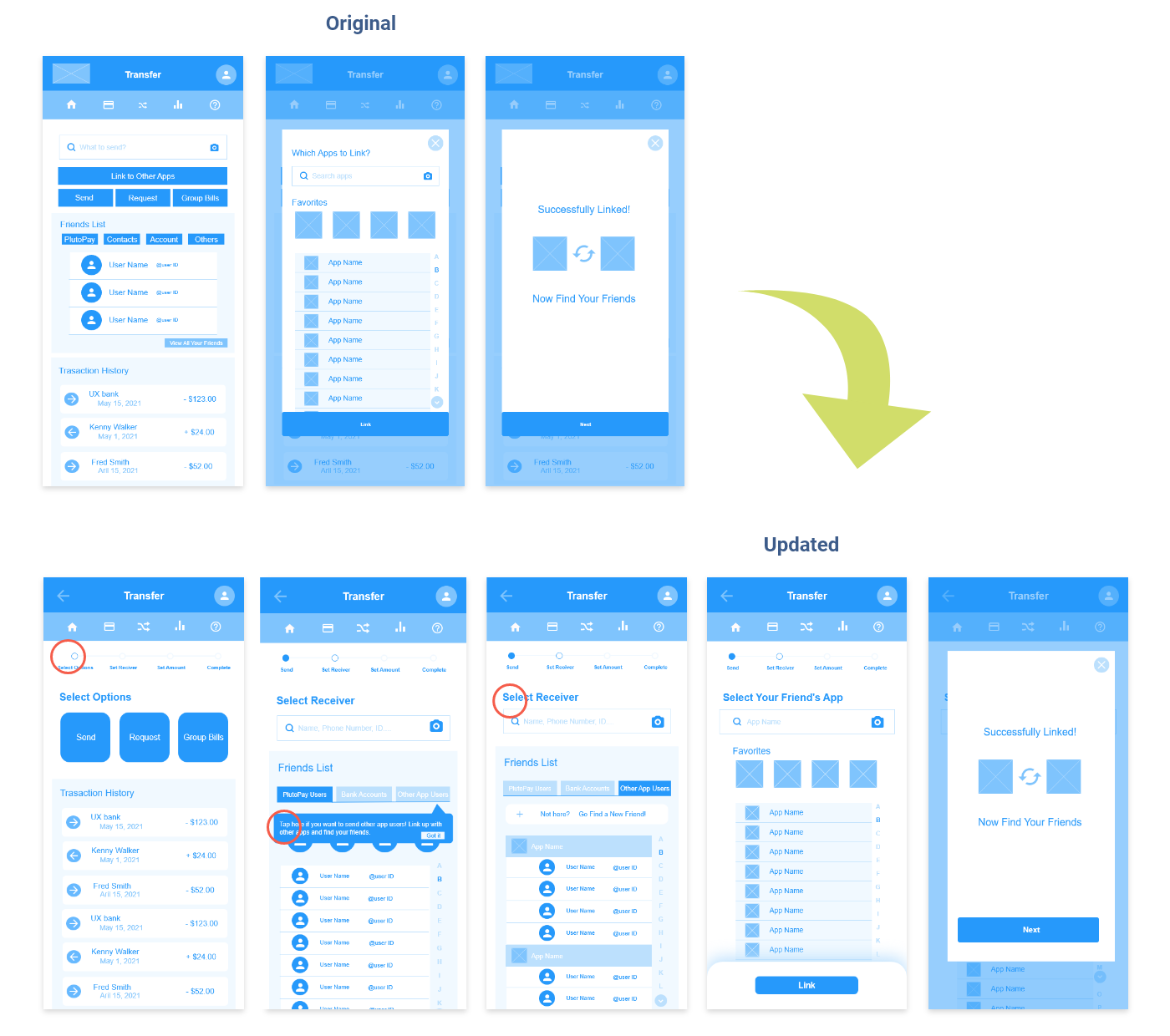
Revision #1
Issue : Participants don't know what to do first to link with other apps. ( High Severity )
Suggested change
- Display a coach mark for users who are using the money transfer function for the first time.
- Add an indicator that shows what steps are required to complete the money trasnfer.
- Reorganize the process of linking and add brief instructive sentences to each screen to let users know what to do onthe page.
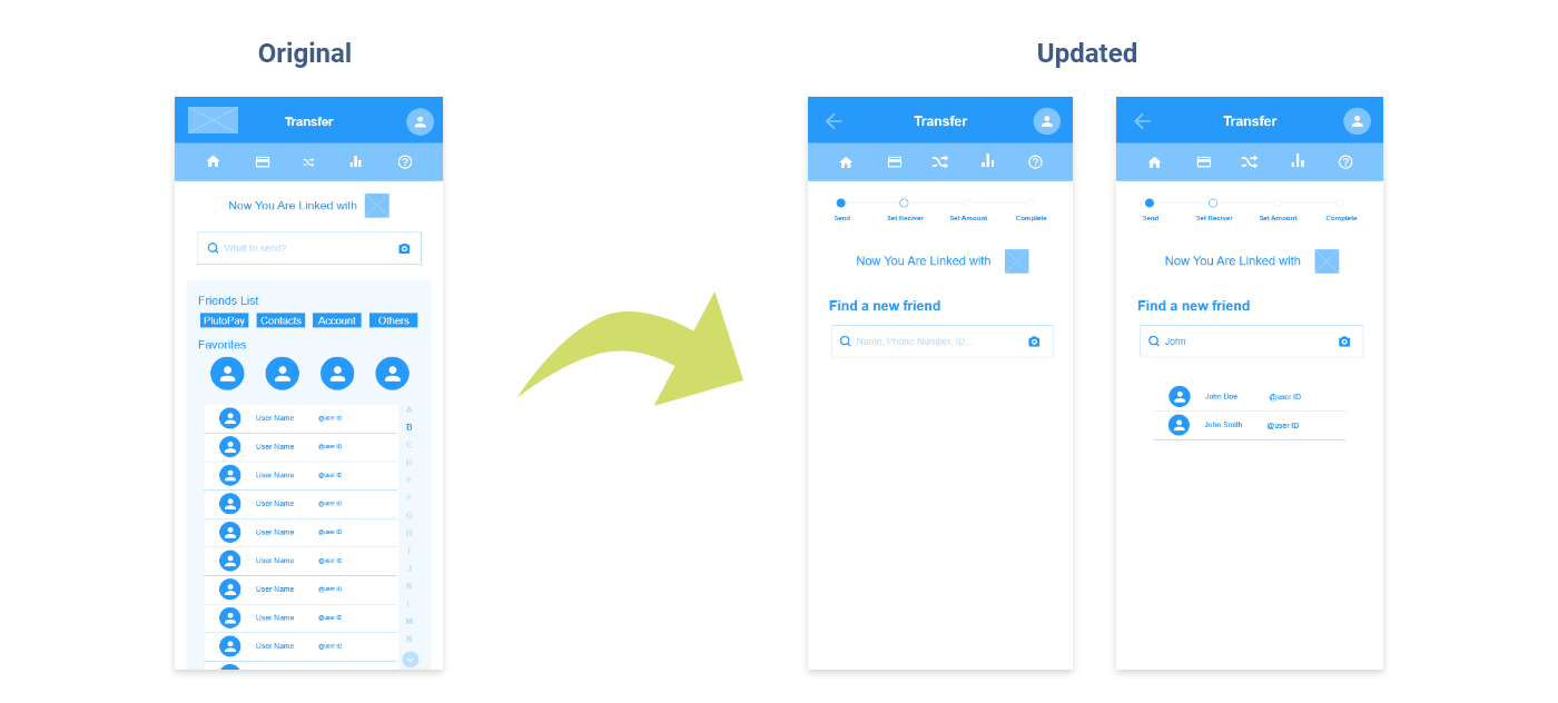
Revision #2
Issue : Participants couldn't figure out how to find new friends after connecting to other apps. ( High Severity )
Suggested change
- Reduce the number of options on the screen after linking and show only the search bar.
- Display a label that suggests what should be entered in the search bar.
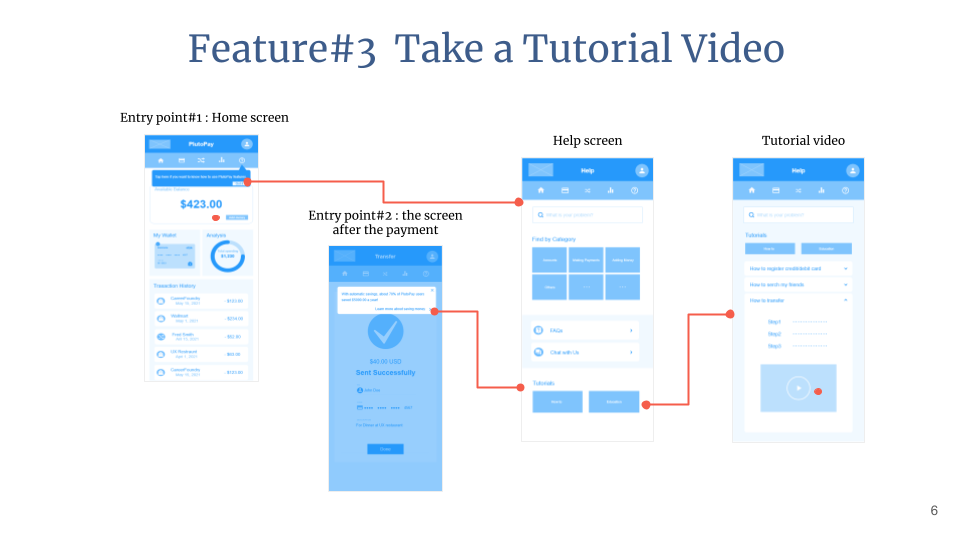
High-Fidelity
After making the above changes, I continued to reconsider the design. I refined the UI by creating a design language and referring to the Accessibility Guidelines (WCAG). Preference tests and peer reviews were also conducted for further improvements. These design iterations eventually led to the High-fidelity Prototype. Below are some of my design iterations.


FINAL THOUGHTS
As a financial app that deals with sensitive information, it was difficult to build a trust with users and create a design that they would feel comfortable using. Also, since most users would be using the PlutoPay's unique feature of "sending money to different e-wallets" for the first time, which is not available in other existing apps, I needed to provide a clear process and sufficient information to avoid confusion while maintaining simplicity. Through this case study, I learned that it is important to create a well-balanced design between simplicity and security in order to produce a financial app that provides a good user experience.
NEXT STEPS
I will further iterate on the design process. First, I would like to run another usability test to make sure that the current design that I have changed is useful for the users. I also have a new hypothesis that users need the ability to have their credit card or bank automatically debited when their PlutoPay account or virtual card is low on balance, so I would like to conduct research and usability testing to substantiate this hypothesis, as well as consult with developers to see if this feature is technically feasible.